專注Java教育14年
全國咨詢/投訴熱線:400-8080-105
更新時間:2022-09-01 10:03:13 來源:動力節點 瀏覽1266次
CSS中怎么讓div垂直居中?動力節點小編來告訴大家。
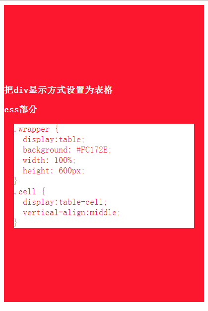
這個方法把 div 的顯示方式設置為表格,然后我們可以使用表格的 vertical-align property 屬性。
HTML & CSS:
 <div class="wrapper">
     <div class="cell">
         <div class="content">
           <h1>把div顯示方式設置為表格</h1>
         </div>
     </div>
 </div>
 .wrapper {display:table;background: #FC172E;width: 30%;height: 600px;}
 .cell {
     display:table-cell;
     vertical-align:middle;
 }
運行效果:
優點:
content 可以動態改變高度(不需在 CSS 中定義)。當 wrapper 里沒有足夠空間時, content 不會被截斷
缺點:
Internet Explorer(甚至 IE8 beta)中無效
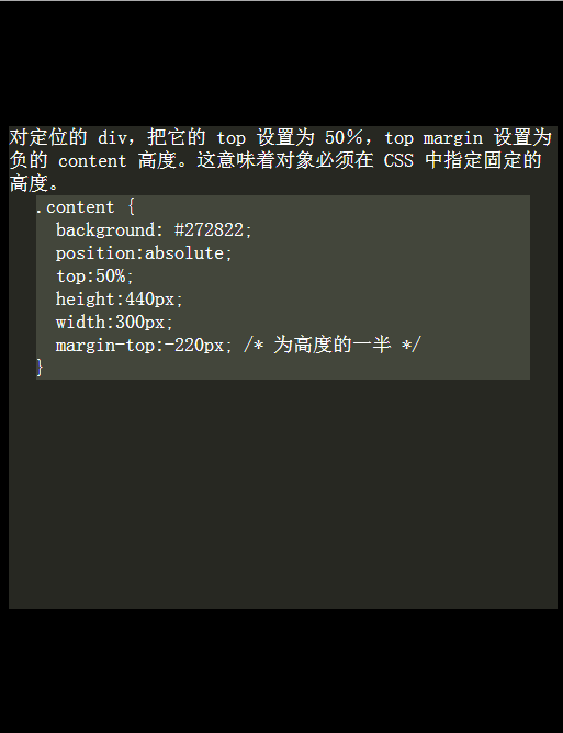
這個方法使用絕對定位的 div,把它的 top 設置為 50%,top margin 設置為負的 content 高度。這意味著對象必須在 CSS 中指定固定的高度。
因為有固定高度,或許你想給 content 指定 overflow:auto,這樣如果 content 太多的話,就會出現滾動條,以免content 溢出。
HTML & CSS:
 <div class="content">
   對定位的 div,把它的 top 設置為 50%,top margin 設置為負的 content 高度。這意味著對象必須在 CSS 中指定固定的高度。
 </div>
 .content {
     background: #272822;
     position:absolute;
     top:50%; height:440px;width: 500px;
     margin-top:-220px; /* 為高度的一半 */
 }
運行效果:
優點:
適用于所有瀏覽器
不需要嵌套標簽
缺點:
沒有足夠空間時,content 會消失(類似div 在 body 內,當用戶縮小瀏覽器窗口,滾動條不出現的情況)
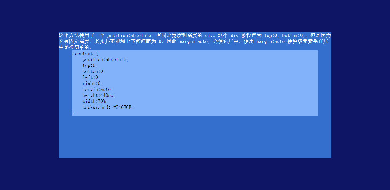
這個方法使用了一個 position:absolute,有固定寬度和高度的 div。這個 div 被設置為 top:0; bottom:0;。但是因為它有固定高度,其實并不能和上下都間距為 0,因此 margin:auto; 會使它居中。使用 margin:auto;使塊級元素垂直居中是很簡單的。
HTML:
 <div class="content">
     這個方法使用了一個 position:absolute,有固定寬度和高度的 div。這個 div 被設置為 top:0; bottom:0;。但是因為它有固定高度,其實并不能和上下都間距為 0,因此 margin:auto; 會使它居中。使用 margin:auto;使塊級元素垂直居中是很簡單的。
 </div>
CSS:
 .content {
     position:absolute;
     top:0;
     bottom:0;
     left:0;
     right:0;
     margin:auto;
     height:440px;
     width:70%;
     background: #346FCE;
 }
運行效果:
優點:
簡單
缺點:
IE(IE8 beta)中無效
無足夠空間時,content 被截斷,但是不會有滾動條出現
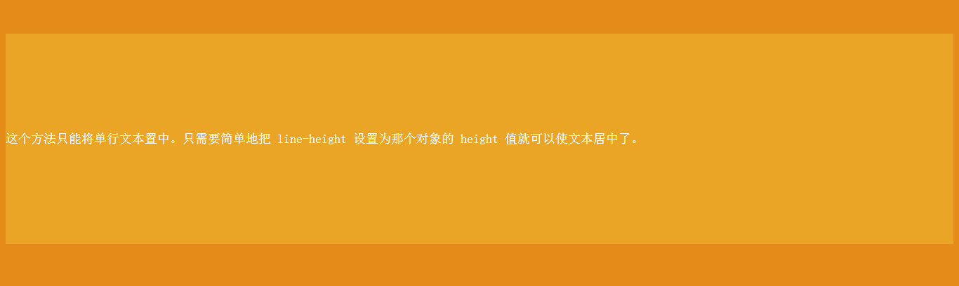
這個方法只能將單行文本置中。只需要簡單地把 line-height 設置為那個對象的 height 值就可以使文本居中了。
HTML:
 <div id="content">
       這個方法只能將單行文本置中。只需要簡單地把 line-height 設置為那個對象的 height 值就可以使文本居中了。
 </div>
CSS:
 #content {
     margin: 50px auto;
     height:300px;
     line-height:300px;
     background: #EAA527;
 }
運行結果:
優點:
適用于所有瀏覽器
無足夠空間時不會被截斷
缺點:
只對文本有效(塊級元素無效)
多行時,斷詞比較糟糕
這個方法在小元素上非常有用,例如使按鈕文本或者單行文本居中。
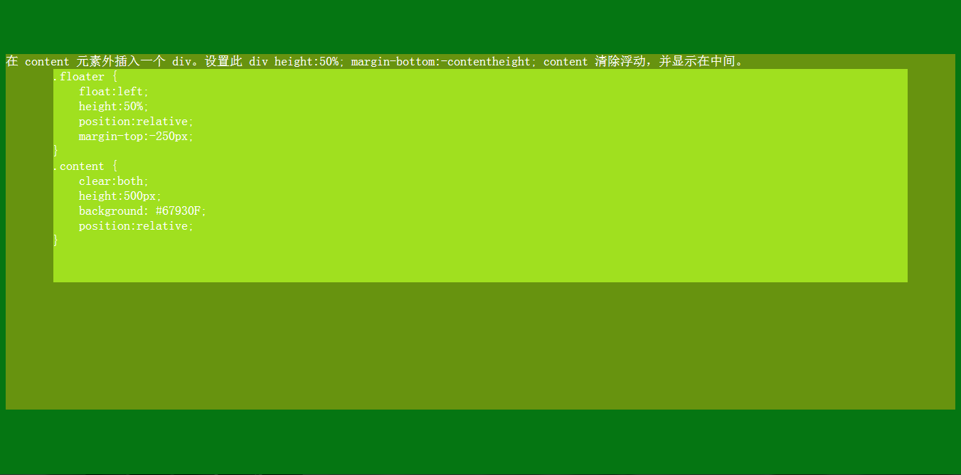
這種方法,在 content 元素外插入一個 div。設置此 div height:50%; margin-bottom:-contentheight;。
content 清除浮動,并顯示在中間。
HTML:
 <div class="content">
       在 content 元素外插入一個 div。設置此 div height:50%; margin-bottom:-contentheight; content 清除浮動,并顯示在中間。
 </div>
CSS:
 .floater {
     float:left;
     height:50%;
     position:relative;
     margin-top:-250px;
 }
 .content {
     clear:both;
     height:500px;
     background: #67930F;
     position:relative;
 }
運行效果:
優點:
適用于所有瀏覽器
沒有足夠空間時(例如:窗口縮小) content 不會被截斷,滾動條出現
缺點:
唯一能想到的就是需要額外的空元素
 Java實驗班
0基礎 0學費 15天面授
 Java就業班
有基礎 直達就業
 Java夜校直播班
業余時間 高薪轉行
 Java在職加薪班
工作1~3年,加薪神器
 Java架構師班
工作3~5年,晉升架構
提交申請后,顧問老師會電話與您溝通安排學習


官方微信

官方抖音


 京公網安備 11030102010736號